

Monday, January 30, 2012
Wednesday, January 25, 2012
Class 3 Logo Critiques
The Traditional Nintendo Logo:
It seems dated, chunky and overall boring. As far as the technical aspects of the logo goes, it does the job and it's become an iconic logo with it's stability throughout the years - but even steady and stable firms have a tendency to change or modernize logos to keep up with the times. They clearly are aware of how to design more sleek and pleasing logos, as is clear in their console logos, which sets it to a stark contrast against this time-weathered design. The Nintendo logo is kind of eye-catching in a bad way, the bright-red on white might have once been in style, but the bright colors just cause visual displeasure. On some media they have fixed this particular issue and replaced the red with a more gray, easily adjustable color, but the staleness of the logo is a constant. For a firm that bills itself as "family friendly" one would consider perhaps a more upbeat logo, or at least a logo that might better attract the target audience in some method. Right now it's so stale that it really fails at that in my opinion.
It seems dated, chunky and overall boring. As far as the technical aspects of the logo goes, it does the job and it's become an iconic logo with it's stability throughout the years - but even steady and stable firms have a tendency to change or modernize logos to keep up with the times. They clearly are aware of how to design more sleek and pleasing logos, as is clear in their console logos, which sets it to a stark contrast against this time-weathered design. The Nintendo logo is kind of eye-catching in a bad way, the bright-red on white might have once been in style, but the bright colors just cause visual displeasure. On some media they have fixed this particular issue and replaced the red with a more gray, easily adjustable color, but the staleness of the logo is a constant. For a firm that bills itself as "family friendly" one would consider perhaps a more upbeat logo, or at least a logo that might better attract the target audience in some method. Right now it's so stale that it really fails at that in my opinion.

Gerber Baby! For the most part it does a good job of hitting it's target audience (parents) and gives a good idea as to whom will be using it (babies) and gives the impression that using gerber products will lead to a happy baby which is a good marketing technique. Overall the cuteness of the logo works, and the contrast between the simplistic ouline/text and more traditional sketched in baby make it visually appealing with a color scheme that is easy on the eyes.
Star Wars! It's iconic, basic SW logo fit the goal perfectly at the time of it's inception. It used the aesthetic senses at the time of what "futuristic" text and etc is like, and has since been slightly updated color-wise to give it a sleeker more updated look, but keeping the classic and easily identifiable logo. The Old Republic in this case is set really nicely against that traditional logo because it's got a type of font that gives the idea of being slightly older, the simpler gradient also giving off an older feeling, using a similar type-face as that of it's prequel, which works as it's identifiable, gives people an idea of what to expect, and it's overall pleasing on the eye. It manages to make basic text fairly interesting, but it doesn't give that good an idea of what the product at hand is.
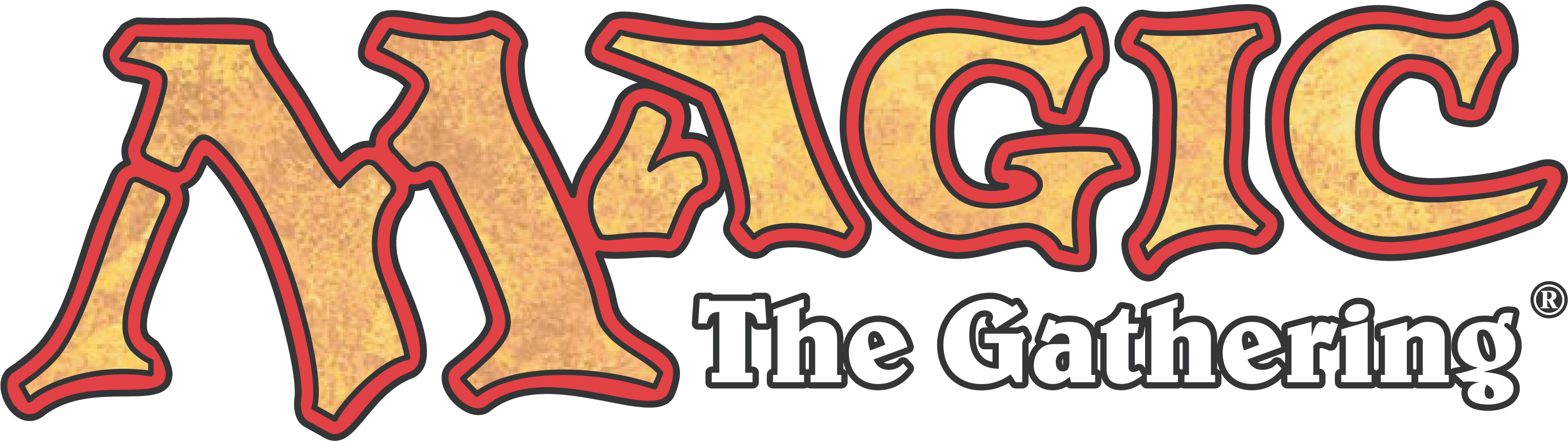
Magic! The font and color scheme is pleasing and gives off a rustic feeling that suits the name and subject matter. It's got a rather space-efficient logo but it doesn't say much about the product itself. It's pleasing and it places the focus on the major source, with the sub-header being completely in the background as it should be, which is a nice touch. It looks like it might be aimed at either teenage geeks with an affinity for the supernatural or older folks with a more fantasy-oriented taste. Which is pretty clever because although it's not exactly clear what it IS, it manages to make itself somewhat attractive to it's target audience anyways.
Complimentary color scheme, sleek and slightly simplistic look generates a pleasing outcome. The logo seems to indicate that somehow this product is the "golden egg" which servers to make as good marketing. Overall makes a pleasing outcome out of a nonsensical name. It's target audience is basically everyone, and it does a good job of that with at least a somewhat memorable logo.
Monday, January 23, 2012
Industrial Takeovers, Oh My
Firms to Foray into-
Mando Hunters-
"Tired of those Bounty Hunters? Someone recently hire one out to take your head? Are you a weak and sniveling coward? Or perhaps just wish to take preventive action? Well now you can! Mando Hunters will bounty hunt your bounty hunters!"
Fictional and silly idea rooted in the Star Wars universe. Logo wise would be text with a Bounty Hunter's helmet for the O, or the entire design would be inside a T-Visor Mando helmet with the word Mando written horizontally across the top part of the visor and Hunters intersecting at the N vertically.
Gerber's Vodka-
"Why should the fun of alcohol only be for Adults? Now you can get them started early with this specially mixed Vodka drink that is perfect for your baby's tummy."
Another silly idea. Perhaps the Gerber baby with a bottle of vodka in his hand?
Artificial Date-
"Real girls constantly putting you down and making life hard for you? Are you tired and frustrated? Well now there's an alternative so good, that you won't ever need the real thing again!"
Ok yeah, this was an idea given to me by a friend, wouldn't even know how to logo-fy it but it was amusing enough to warrant a spot.
D4C (Dirty Deeds, Done Dirt Cheap)-
"Got problems in your life of love? Having troubles with your highschool head? Don't like the guy down the street? We can fix all of it."
Inspired by the ACDC song of the same name. A do-all company that will legitimately do everything the client wants, provided by the price is right.
Realtime Savepoints-
"Always wanted to go back to that one point and redo it? Wish save points existed in real life? Well for the right price, now they do! Through ground-breaking transdimenionifier technology, you can now create and go back to your very own save points! Amount available and reusability vary on package.
Quote says it all. A device (Watch/Remote/Wristguard/Necklace/Moretocome) that allows the user to create as many save points as it has primary charges, and to use them as many points as it has secondary charges. It doesn't allow them to recreate time and space, because that would be silly. It simply sends them back in time and shifts the user to an alternate timeline where they make the choice they have in mind. Silly don't you know time doesn't simply rewrite itself? No, thats why millions of alternate timelines exist, duh~
Ultimate Game Console-
"Tired of being tied down to play a game? Or maybe you're tired of those portable games requiring you to pay attention? Maybe you just want to play while being able to work, or work out, or go to school, and still be able to multitask? Well the UGC provides a solution! With a cross-console port that allows it to hook up to any game and any source for games, now you can play on the go with merely your eyes and your mind with this gadget!"
Physically it'd be sort of a one-sided headset. The ear portion locks itself behind the head and then extends itself over to one of the user's eyes, a transparent crystaline patch covers the eye which shows the game in perfect quality and perfect sound. Comes with a receiver that reads brainwaves that triggers when the player focuses on their "screen" for perfect hands-free on the go playing.
Nintendo-
Not much to say, kind of interested in designing an alternative logo for Nintendo, the popular video game company.
Who am I?
Well, I'll tell you who am I, absolutely nobody at all. But then again aren't we all?
I'm a first semester junior in my brand new major of New Media Production (The former EMAT) and an aspiring designer of both the graphical and coding variety. Which pretty much says, as far as all artistic and mechanical purposes go, what I'm capable of. I can tinker and fiddle with all sorts of programs and play with all sorts of random codings I've picked up over the years. Stylistically, I tend to go for a more Modern Chic/Punk look on most things, as they tend to be in my opinion the most aesthetically pleasing. The former being infinitely more elegant than the latter. Through this class of ART210 I simply hope to advance my knowledge of a few programs and be able to channel my creativity better.
And with that, I bid you adieu.
Subscribe to:
Posts (Atom)